
The Challenge
Traditional furniture websites sold us the latest deal for an old-style piece. Ikea revolutionized our decoration habits - and killed our uniqueness along the away. Now, people dream of their unique decorations and furniture at an affordable price. As a result, the home decor e-commerce space as exploded over the last couple of years with sites like One Kings Lane, Fab, Houzz or Wayfair.
With Delumu, the goal was to redesign the entire site, bringing an improved user experience and a new visual identity.
As the only designer in the team, fast iteration and regular checkpoints were key to manage expectations and progress fast. Given the deep and complex product catalog, Information Architecture (IA) was the key nut to crack.
Research & Strategy
Delumu had already been live for a year and a half when I joined. This provided a lot of user information. The audience was tech-savvy women between 25-40 years old who appreciate exclusive home decor pieces at affordable prices. They usually spend between 20 min and one hour navigating the site, and connect mainly during weekends or week nights. These women are heavy users of Pinterest and curated home decor blogs and websites.
To understand Delumu’s competitors, their strengths and weaknesses, I studied the European market, focusing on the Spanish market.
There were different styles and target audiences, but I found a common pattern: a lack of structure and poor content organization. All these sites - including Delumu - were crowded with products, advertisings, flash sales, confusing calls-to-action, and many other elements that resulted in an unpleasant navigation and distracted the user from the ultimate goal: to buy.
User Pain Points
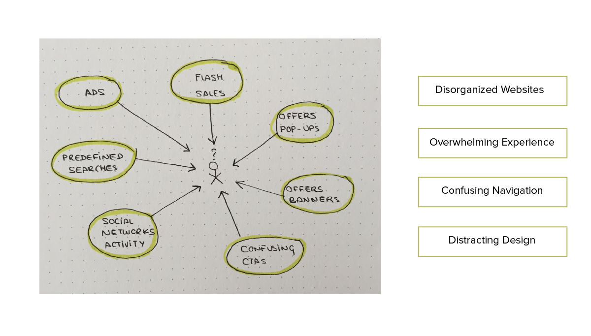
After running some quick usability tests on Delumu’s site and some of its competitors, I identified the main pain points and areas of improvement, and confirmed the need for a clear navigation and structure.
This drove my strategy for Delumu’s redesign:
- Strong IA and intuitive navigation to make the discovery process delightful
- A delicate and visually calm interface with an emphasis on high quality imagery
Content Organization
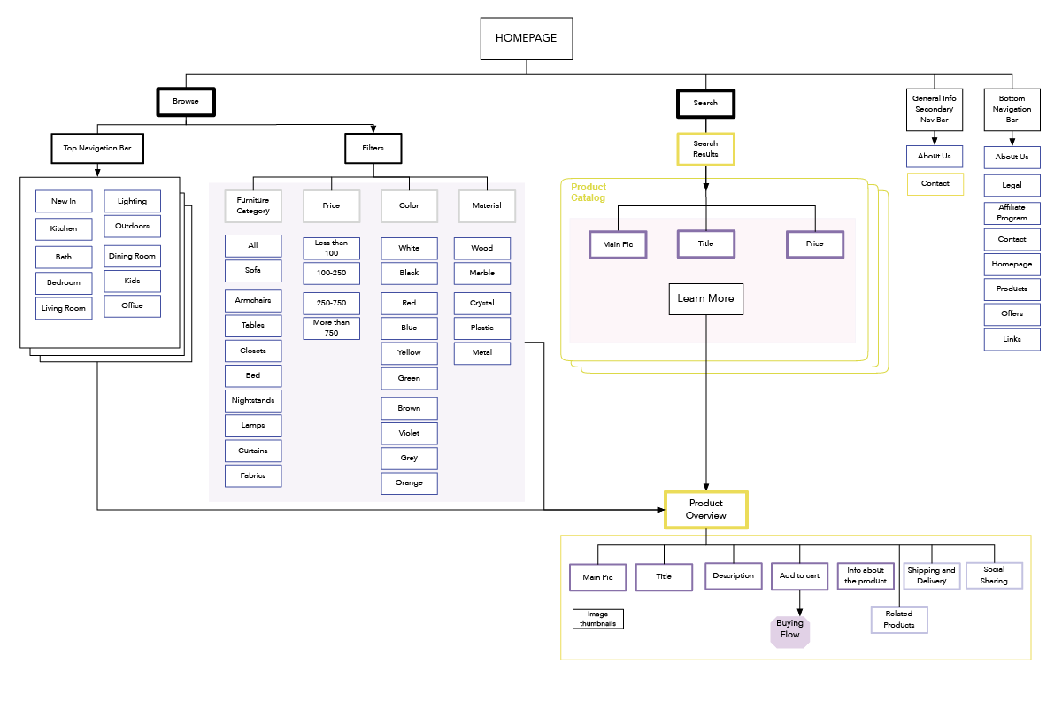
To provide an intuitive navigation system for the marketplace, we first collected the content for the site and created a site map to establish a hierarchical structure.
The site map reflects the main content areas and navigation:
Initial Sketches
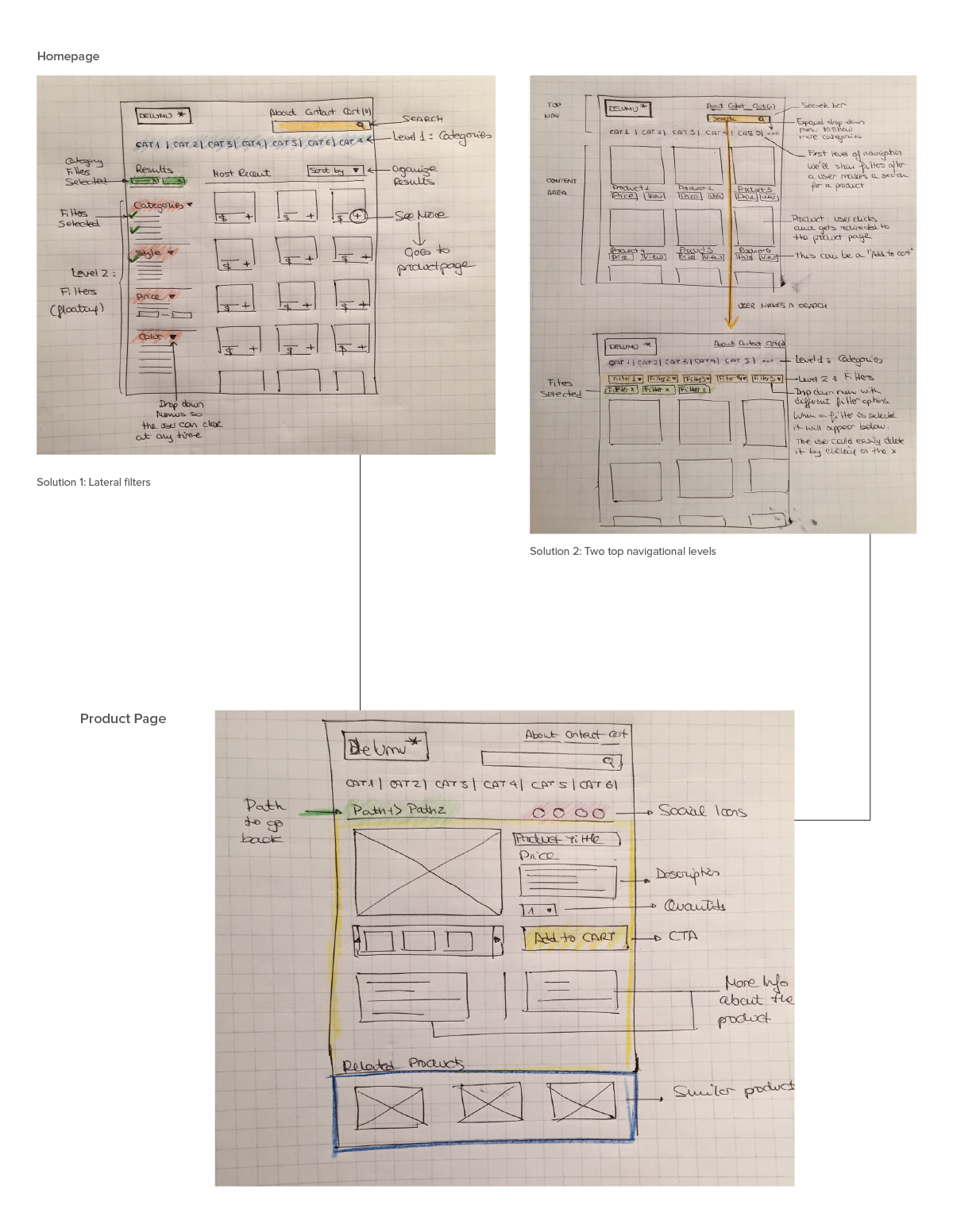
The initial user research and the new content organization gave me a clear idea of the layout that would meet our users' needs:
- 2 Navigation levels: main categories as top navigation and filters as lateral navigation
- Prominent display of product catalog
I also provided another design concept, with the categories and filters as top navigation menus, but the team preferred Solution 1 since it made them feel more in control as users. In terms of development, it also provided more flexibility to display large filter options.
Below, I included the sketches with the two different approaches for the homepage and one solution for the product page.
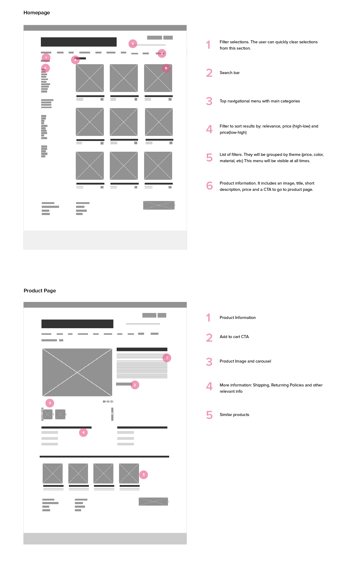
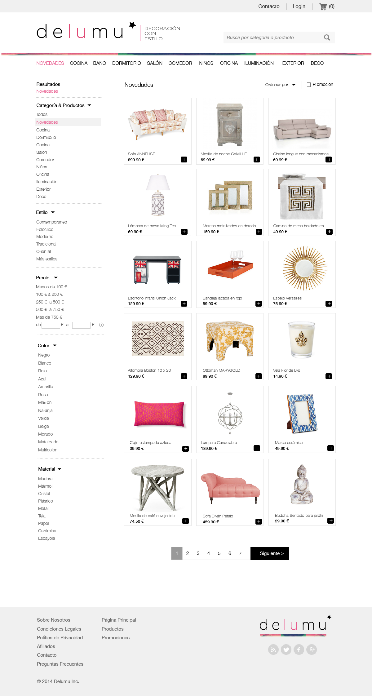
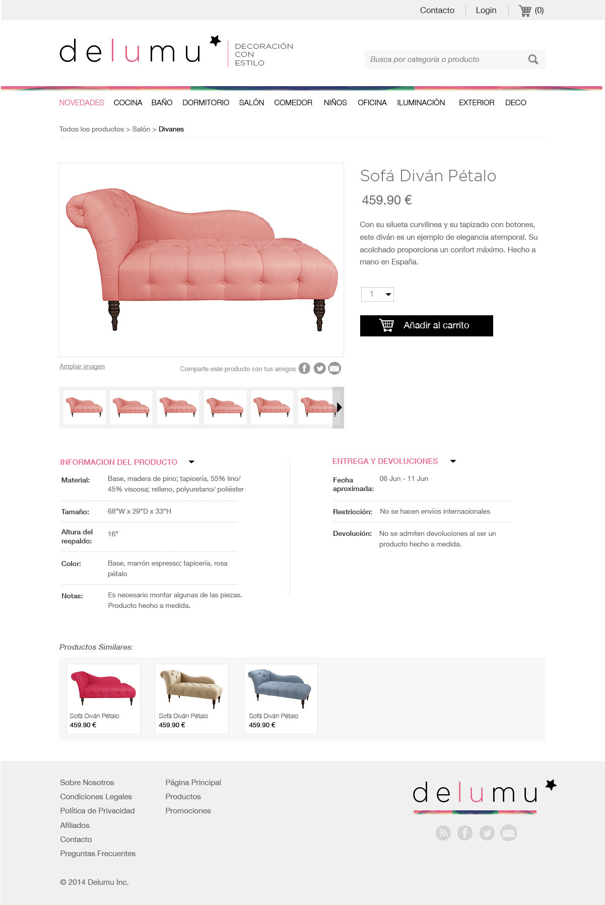
Final Wireframes
After the initial feedback on sketches, I wireframed them to get a better sense of the final design for the homepage and product pages.
Visual Identity
From the beginning of the project, it was clear to me that the site needed a fresh, clean and minimalistic approach to balance the
complex structure and image-heavy design.
From a User Experience standpoint, the initial complex structure was simplified through a clear hierarchy and content organization. The visual design needed to complement this structure, creating a personality for the site without adding clutter.
Color Palette
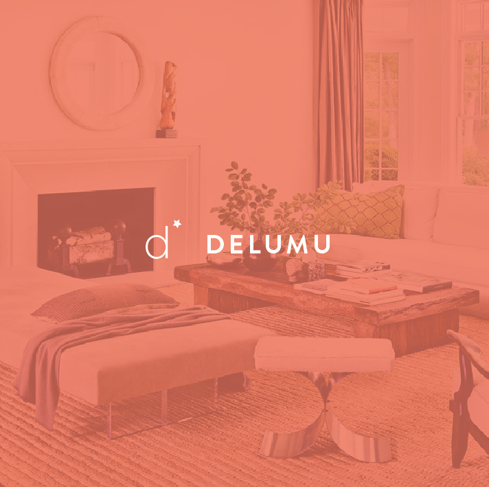
I selected a clean color palette, with white, grey and black as main colors, and very subtle pink and green touches.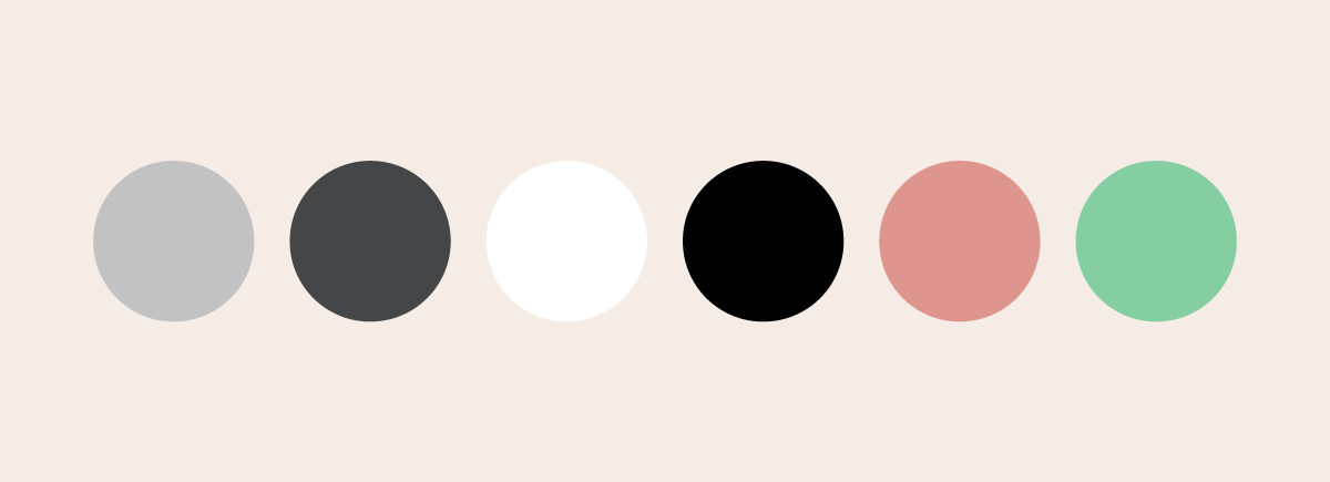
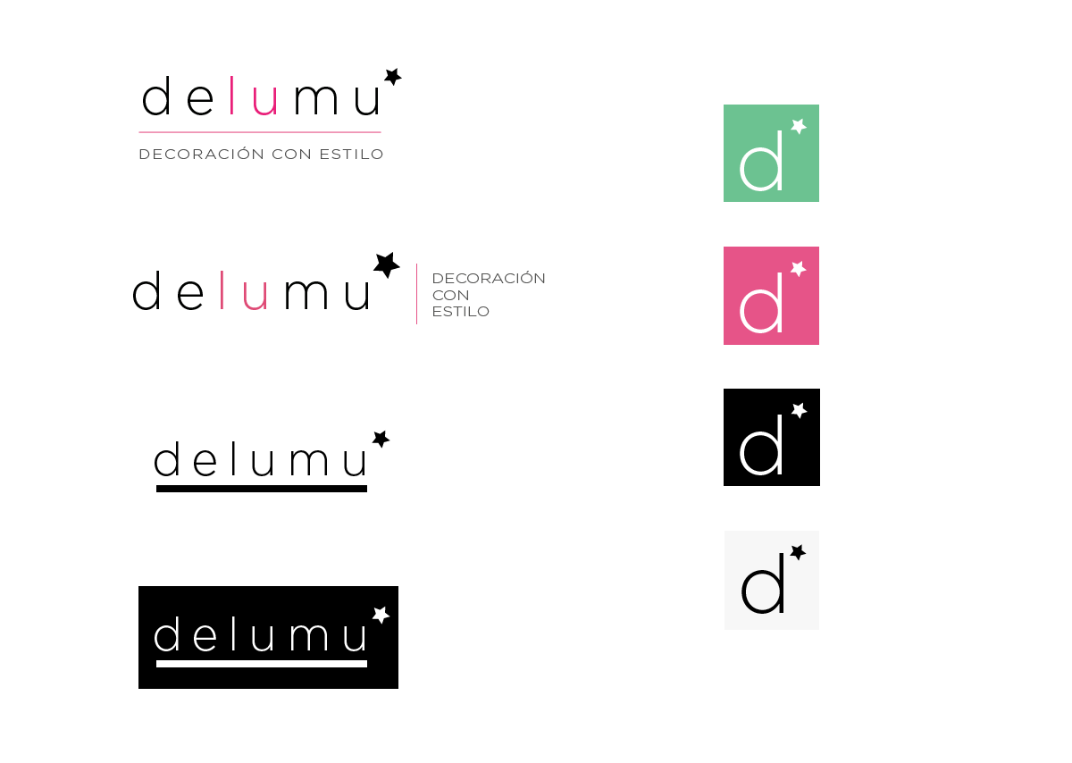
Logo
The team wanted something simple, so I decided to give all the attention to the font. I tried different styles, fonts and color combinations. Here are some variations:
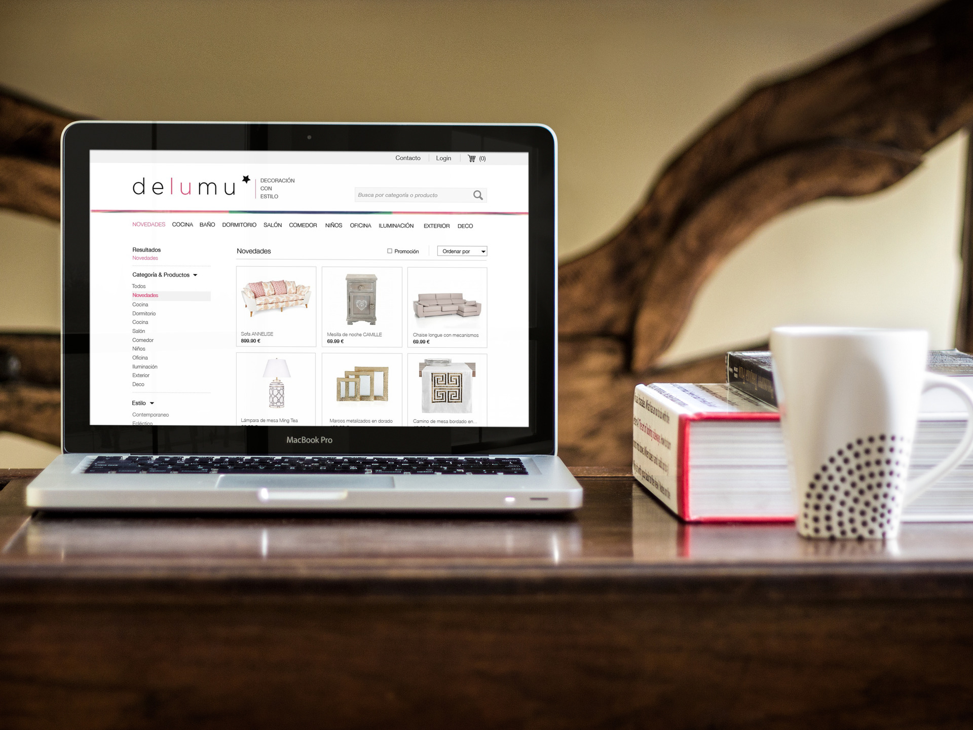
Final Design
After approving the visual identity, I created the final mockups for the homepage and product page.
Next Steps
The new site went live a couple of months ago and the team is now gathering consumer insights to define the requirements for the next design phase.
Redesigning Delumu, a Home Decor e-Commerce Company
Delumu is an e-commerce company for home decor and furniture based in Madrid, Spain. Delumu moves away from a traditional Home Decor website that overwhelms the user with options. Instead, it offers their users a curated selection of unique pieces of furniture.
I worked as the only designer of the team with Delumu’s engineers and business team. I owned everything from Research to final mocks. My main focus was UX and Interaction Design for the home and product pages. I also created Delumu’s new visual identity.


